728x90
막대그래프는 표에 비해 여러 항목의 수량을 전체적으로 비교하기 좋다. 가장 기본적인 차트 중의 하나이다.
import matplotlib.pyplot as plt
import seaborn as sns
if __name__ == '__main__':
sns.set_style(style="whitegrid")
tips = sns.load_dataset("tips")
tips = tips.groupby('day').mean()['total_bill'].reset_index()
print(tips)
bar = sns.barplot(x="day", y="total_bill", data=tips)
plt.show()
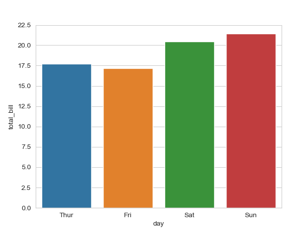
결과 값
day total_bill
0 Thur 17.682742
1 Fri 17.151579
2 Sat 20.441379
3 Sun 21.410000
728x90
'Data Science > Data Visualization' 카테고리의 다른 글
| [02. Line Chart] 001. Multi-Line Chart (0) | 2021.08.21 |
|---|---|
| [02. Line Chart] 001. Line Chart (0) | 2021.08.21 |
| [01. Bar Chart] 004. Percentage Stacked Bar Chart (0) | 2021.08.21 |
| [01. Bar Chart] 003. Stacked Bar Chart (0) | 2021.08.21 |
| [01. Bar Chart] 002. Horizontal Bar Chart (0) | 2021.08.21 |


