728x90
지도에 데이터를 표시하는 맵이다. 크게 3가지가 있다.
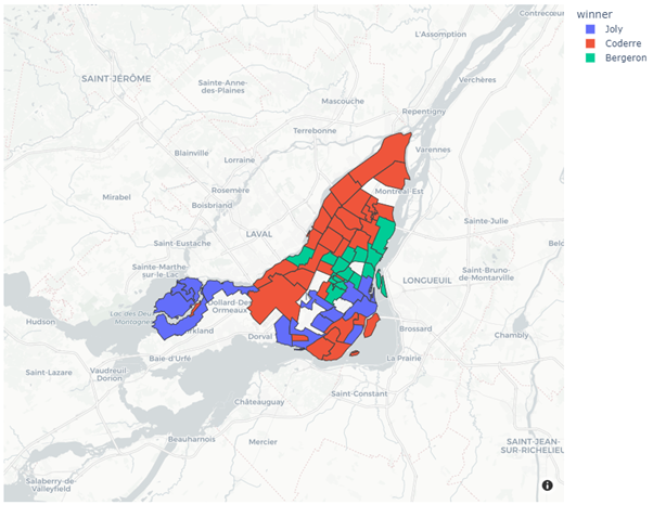
1. 구역지도
색으로 지도 영역에 어떤 값의 범위를 그린 것이다.
import plotly.express as px

if __name__ == '__main__':
    df = px.data.election()
    geojson = px.data.election_geojson()

    fig = px.choropleth_mapbox(df, geojson=geojson, color='winner', locations='district', featureidkey='properties.district', center={'lat': 45.5517, 'lon': -73.7073},
                               mapbox_style='carto-positron', zoom=9)
    fig.update_layout(margin={'r': 0, 't': 0, 'l': 0, 'b': 0})
    fig.show()
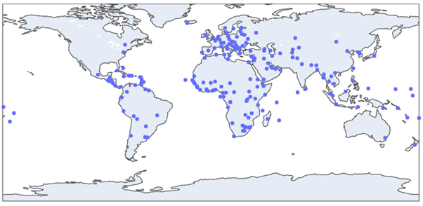
2. 포인트맵
지도 위에 점을 그려 데이터의 위치를 표시한 것이다.
import plotly.express as px
import geopandas as gpd

if __name__ == '__main__':
    geo_df = gpd.read_file(gpd.datasets.get_path('naturalearth_cities'))
    fig = px.scatter_geo(geo_df, lat=geo_df.geometry.y, lon=geo_df.geometry.x, hover_name='name')
    fig.show()
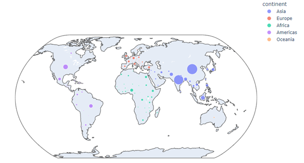
3. 버블맵
지도 위에 원을 그려 데이터의 분포를 표시한 것이다.
import plotly.express as px

if __name__ == '__main__':
    df = px.data.gapminder().query('year==2007')
    fig = px.scatter_geo(df, locations='iso_alpha', color='continent', hover_name='country', size='pop', projection='natural earth')
    fig.show()
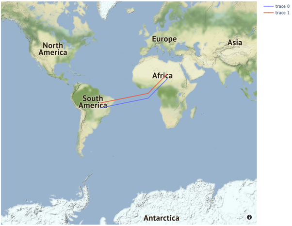
4. 플로우맵
지도 위에 지리적 이전 분포를 표시한 것이다. 동적 선을 사용하여 움직임을 애니메이션으로 보여주면 시각적으로 도움된다.
import plotly.graph_objects as go
import plotly

if __name__ == '__main__':
    fig = go.Figure(go.Scattermapbox(mode='markers+lines', lon=[-50, 0, 20], lat=[-15, -5, 15], marker={'size': 1}))
    fig.add_trace(go.Scattermapbox(mode='markers+lines', lon=[-50, 0, 20], lat=[-10, 0, 20], marker={'size': 1}))
    fig.update_layout(
        margin={'l': 0, 't': 0, 'b': 0, 'r': 0},
        mapbox={
            'center': {'lon': 10, 'lat': 10},
            'style': 'stamen-terrain',
            'center': {'lon': -20, 'lat': -20},
            'zoom': 1
        }
    )
    fig.show()
728x90
'Data Science > Data Visualization' 카테고리의 다른 글
| [05. Etcetera Chart] 009. Heat Map (0) | 2021.10.06 |
|---|---|
| [05. Etcetera Chart] 008. Gantt Chart (0) | 2021.10.06 |
| [05. Etcetera Chart] 007. Word Cloud Chart (0) | 2021.10.06 |
| [05. Etcetera Chart] 006. Funnel Plot (0) | 2021.10.06 |
| [05. Etcetera Chart] 005. Rader Chart (0) | 2021.09.06 |


